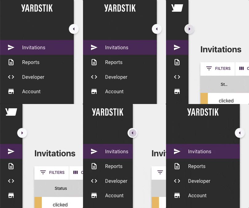
If you’re a Yardstik user, you may have noticed a few look-and-feel updates to our app. Most notably in our new side navigation bar.
Our UX and UI designers have been hard at work behind the scenes, listening to your feedback and making enhancements to the way your team interacts with the Yardstik app.
A few of our customers have already been using the new interface, and we’ve received nothing but great feedback. Now, we’re excited to share that we’ve rolled it out to all of our customers.
Why the changes?
We’re always listening to our customers, trying to better understand how they want to interact with our product, and looking for ways to be better.
This UI change focused on three main areas of improvement:
- Creating an overall better and friendlier mobile experience
- Making our navigation more intuitive—making it easier to find what you need quickly
- Optimizing available screen real estate for desktop use
What’s new?
Functionally, we’re still the same Yardstik you know and hopefully love. We’ve just moved a few things around with these navigation changes and given the experience a fresh coat of paint.
☞ A new vertical, collapsing navigation bar
We’ve replaced our horizontal top-of-page navigation with a more modern and mobile-friendly vertical side navigation bar.
A side navigation bar that not only gives you extra real estate to work with, but also offers the white-knuckle thrills and excitement of interactive collapsing and expanding action!
Check this out:

☞ New iconography
Related to the above, we’ve also introduced a new set of icons to visually guide you to the different areas of the Yardstik app.
Our goal was to make it easier to find exactly what you’re looking for at a glance, even in the collapsed navigation view.
☞ New navigation labels
You may also notice a few elements of our app experience have been renamed, including:
- “Dashboard” has been replaced with “Invitations”
- “Candidates” has been replaced with “Reports”
Functionally, these pages haven’t changed, and the new names represent an ongoing effort to better align labels with the section’s primary purpose. Our goal is to make it as straightforward as possible for users to find what they’re looking for.
What do I need to do next?
If you’re already a Yardstik customer, you don’t need to do anything. You should see these updates the next time you log in (if you haven’t already).
Take it for a spin, click around, and see how it feels. We hope you agree that this is a significant step forward for an already user-friendly experience.
If you have any questions, issues, comments, concerns—we want to hear about them. Send us an email at product-feedback@yardstik.com , and we’ll do our best to help.
And, as always, thank you to all of our customers who continue to help us build and evolve this product. We wouldn’t be where we are without you!